Elvie
︎
2018
︎
2018
My role
Art Direction
Brand Research and Rebranding
UI/UX Design
Art Direction
Brand Research and Rebranding
UI/UX Design
Softwares
Sketch, Adobe XD, Zeplin, Axure and InVision
Illustrator InDesign and Photoshop
Sketch, Adobe XD, Zeplin, Axure and InVision
Illustrator InDesign and Photoshop
Context
As Elvie was expanding, it was necessary to rethink the brand - a job that involved professionals such as a brand strategist, a product researcher and product developers. It culminated with a more coherent and clean brand, adapted to the needs of a growing business.
As Elvie was expanding, it was necessary to rethink the brand - a job that involved professionals such as a brand strategist, a product researcher and product developers. It culminated with a more coherent and clean brand, adapted to the needs of a growing business.
Role specifications
The Elvie rebrand was an essencial task, particularly when a second product was being developed: a breast pump. The brand had to be flexible to receive the new arrival and to accomodate future more, while remaining coherent and consistent with its core values: to improve women's lives through smarter technology.
Together with the Creative Director, we translated theorethical learnings from brand strategists and product researchers into a visual identity, to guide Elvie’s digital and print presences, its products and how Elvie was communicated through photographic material. Stakeholders were part of this process, though informal conversations, group meetings and workshops.
The process was organic, allowing product, print and digital developments to inform each other. As a Senior UX/UI Designer and Art Director, my involvement was primarily focused on the digital presence, particularly on Elvie’s apps and website. Please scroll to learn more ︎︎︎
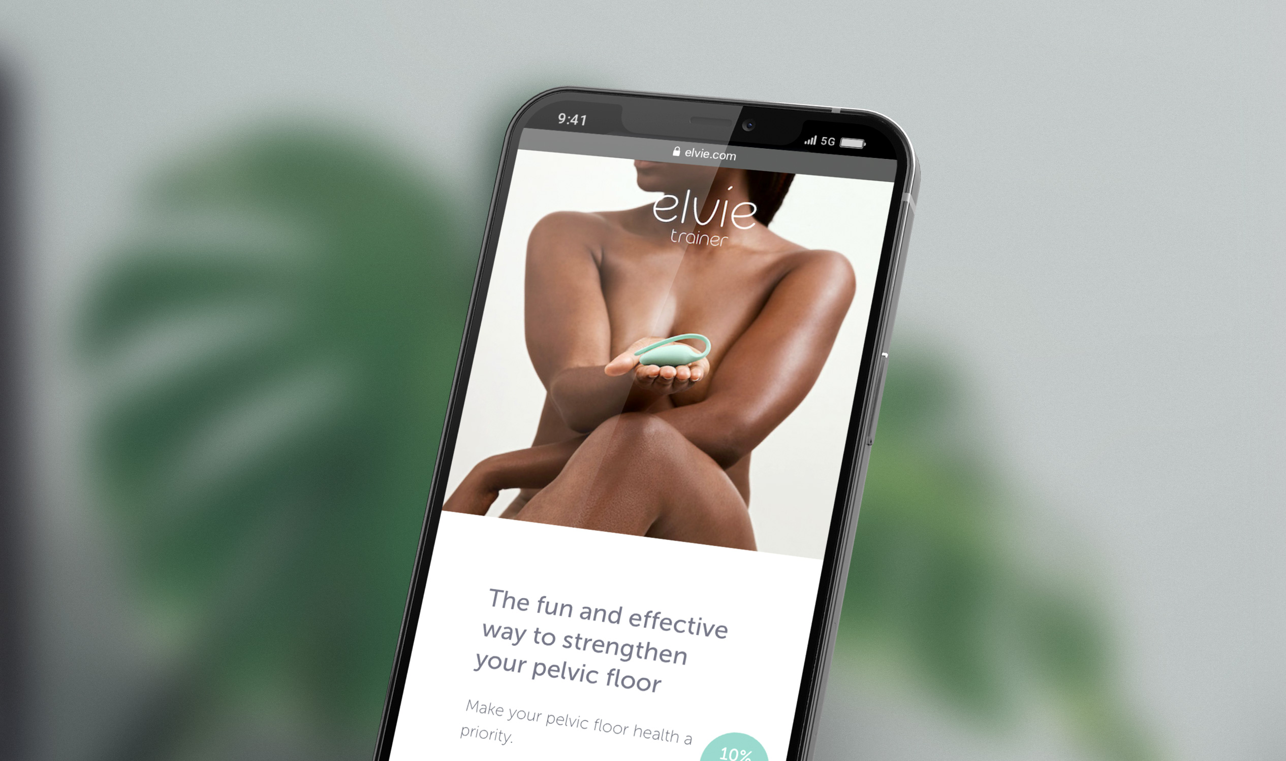
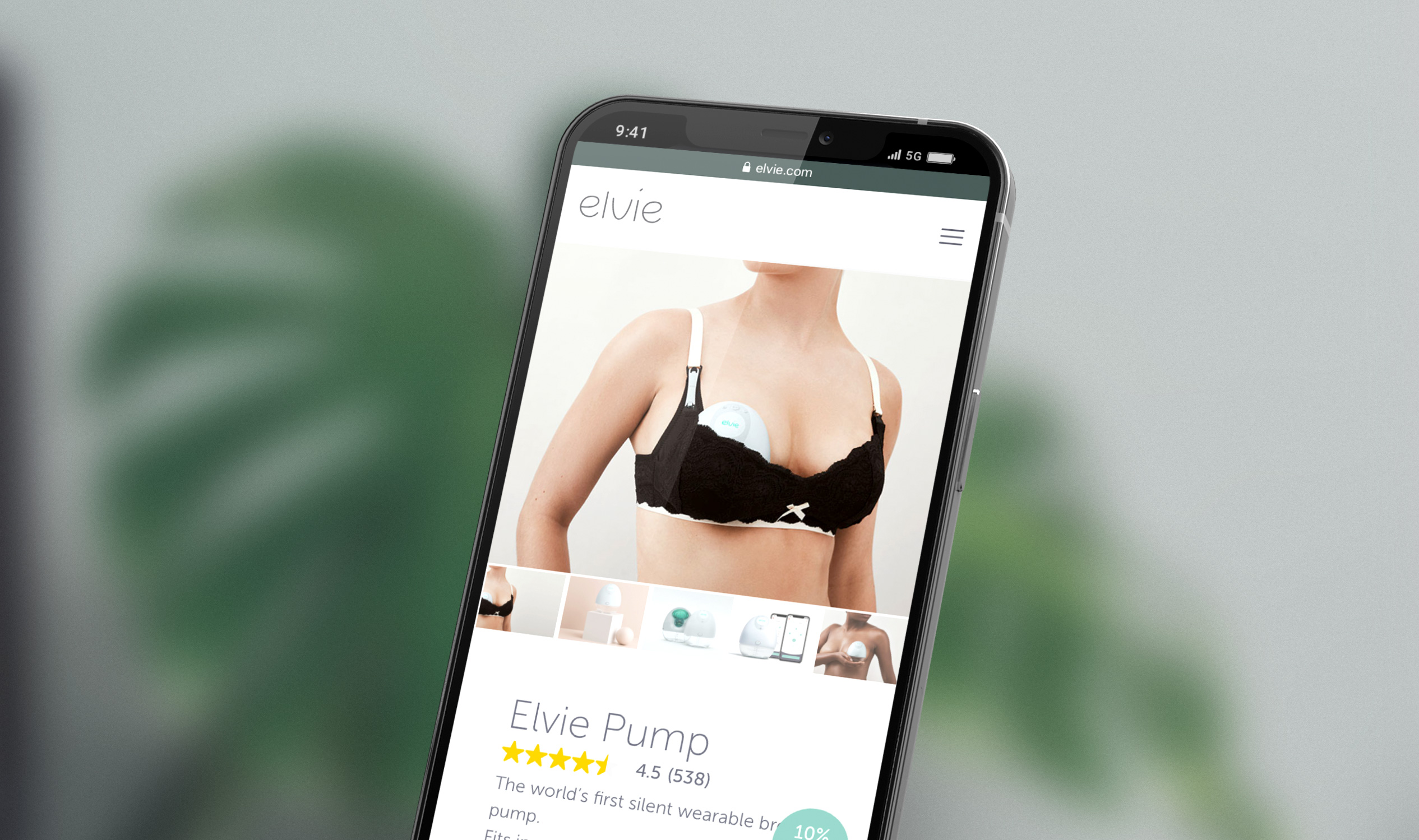
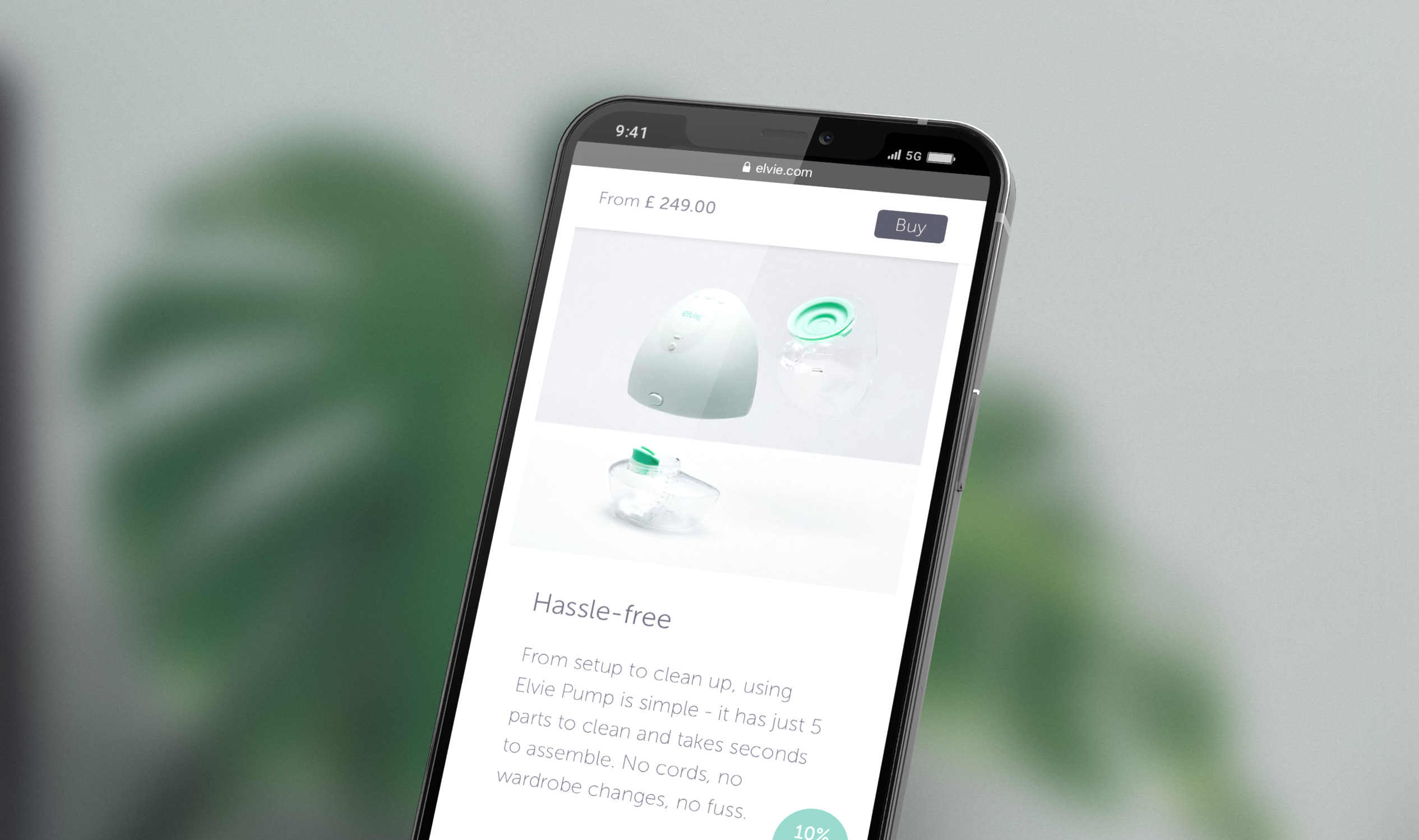
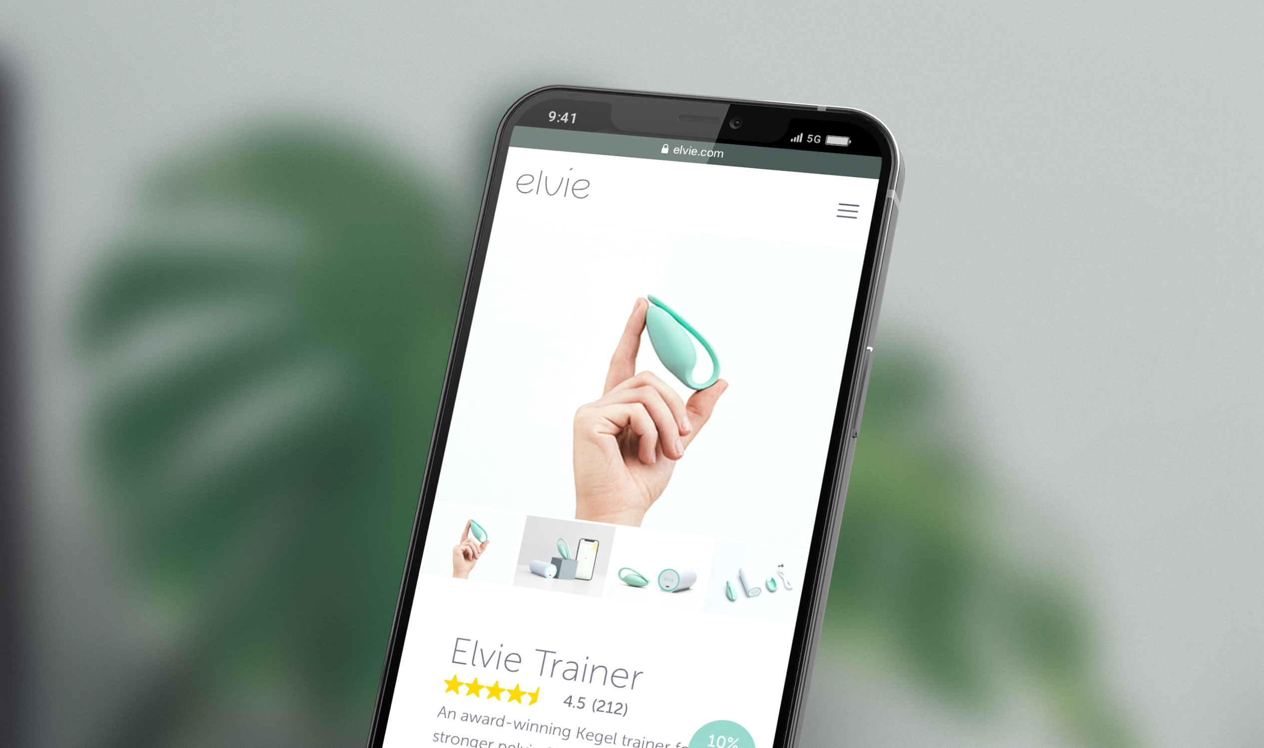
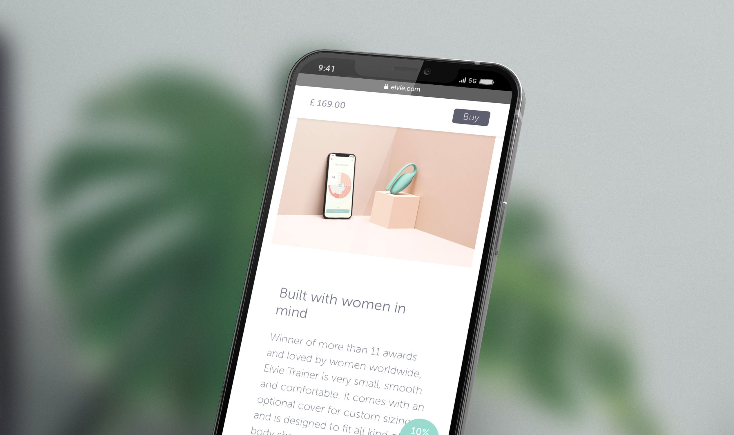
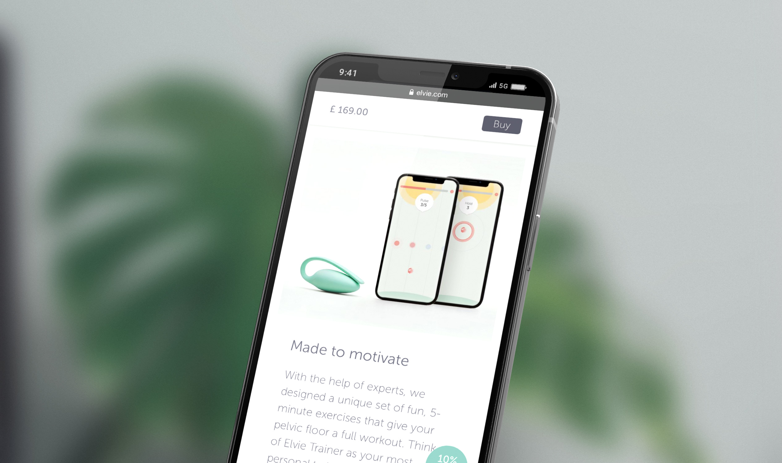
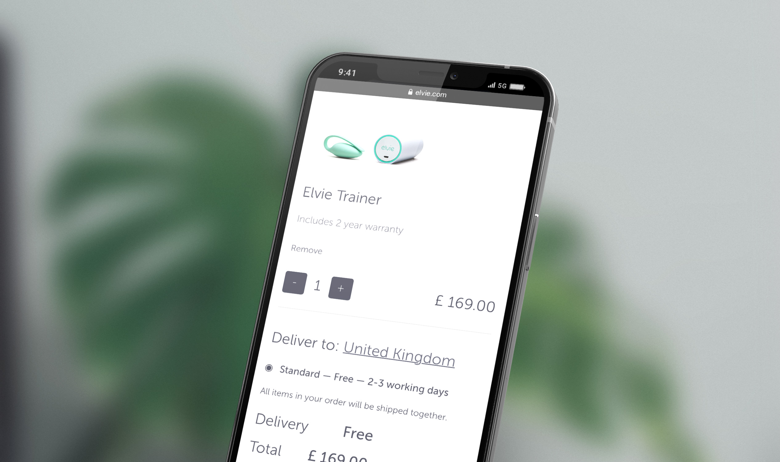
Elvie Website
The previous version of the Elvie website was centered in one product only, whereas the new version had to accomodate multiple products.
As part of the Elvie rebranding, I redesigned the Elvie website to be cleaner and lighter, and to communicate clearer its beatiful products and core message. Simple forms, colours and shapes allowed the products to have a more impactuful presence, letting the imagery narrate their stories. Any text on top of images was avoided in the new designs, allowing better readability and avoiding unexpected alignements between image and text across platforms.
Below, you can scroll through the previous and current versions of the homepage. You can also visit the current website live by following this link, and the previous one using Wayback Machine!
Previous version ︎︎︎
![]()

Current version ︎︎︎
![]()


Home screens of mobile phones are frequently populated with many app icons. Thinking about the brand also required me to think about app icons. Elvie’s emblematic ‘e’ was used as a way to quickly relate to the logo and brand, whereas the colours to the products. Together, the icons form a strong presence on the home screen, while remaining discreet and consistent with Elvie’s core values.
If you haven’t already, please visit the links below to see the designs for the Elvie apps:
Elvie Pump app • Elvie Trainer app
If you haven’t already, please visit the links below to see the designs for the Elvie apps:
Elvie Pump app • Elvie Trainer app